02 Sep Designing The Future: Artwork Trends For The Packaging Industry
Your food is delicious, customer service is on point and you’ve got a healthy core customer base. All’s well and good. It’s a great start but to get your business truly booming, marketing is key. Social media interaction, blog posting and even apps and web updates give a fantastic foundation from which to build but increasingly marketing is being placed in the hands of consumers – literally.
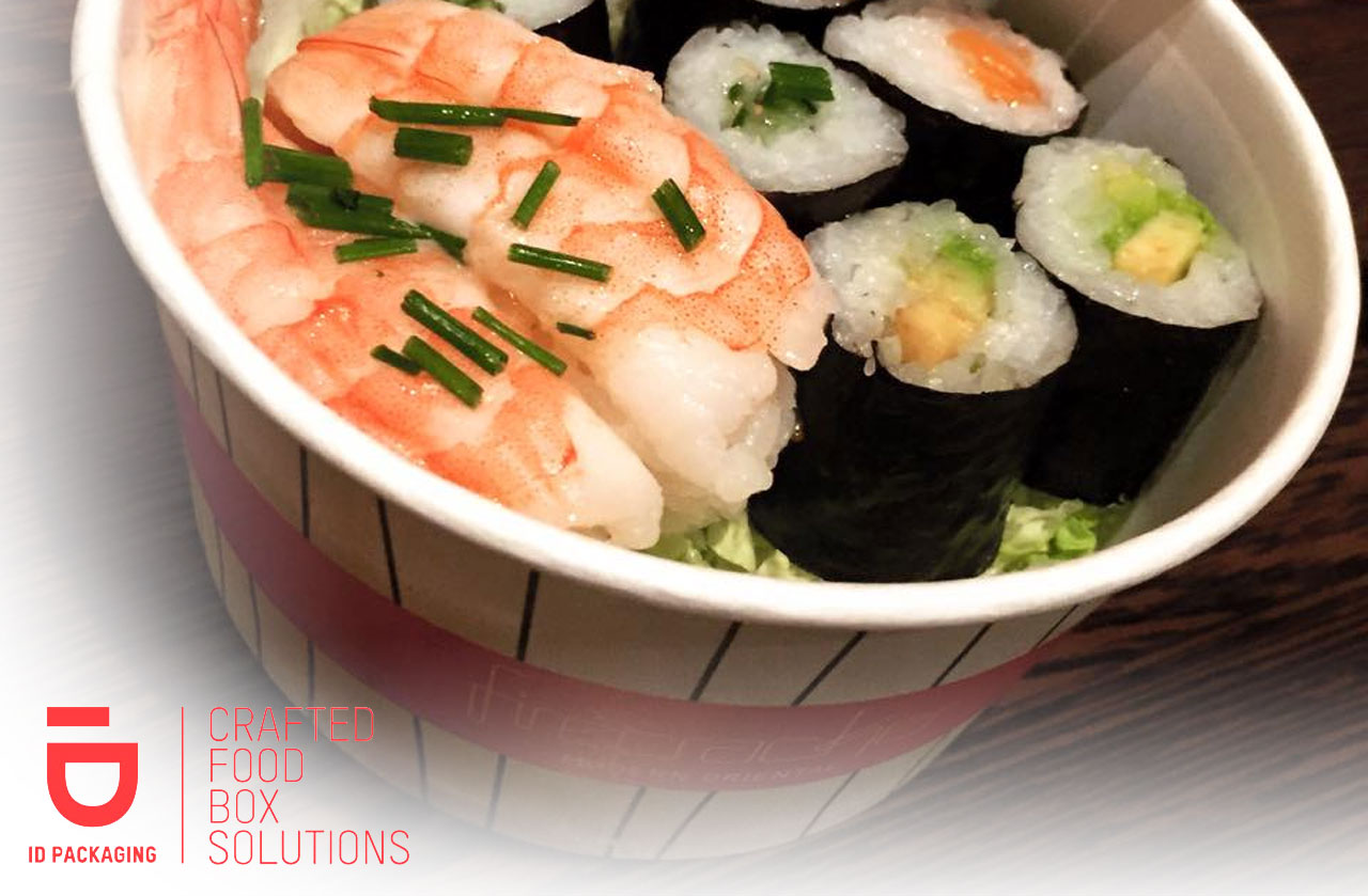
Think about it: your customer leaves the premises with a hot bowl of noodle soup, it tastes and smells tantalizingly good and you want the memory to stick so that business repeats itself – solution? Make your bowl branded so logos and taglines become associated with your food in the customer’s mind. ID Packaging offer custom-prints across all order types and we don’t like to brag (well, just a little) but we’re pretty clued up about what works. Read on to reveal our top tips for packaging design that works for you.
Simple is Best
You may be the next budding Michelangelo but trust us when we say that keeping it simple is your best course of action. Punters at your place don’t have much time to study the detail so simple designs really do pack a punch – logos rather than pictures and clean lines of text will give them all the information they need.
Clean Lines
In the same vein as simple design, clean lines help keep the message clear. Geometric patterns using just a couple of lines can provide an impactful effect without confusing the eye. Remember that customers are likely to see one side of a container more than others so creating a design unique to your business that is wraparound can help keep packaging on-brand without looking messy.
Colour Match
Colours are essential when it comes to branding. If your shop front is baby blue then build on this with consistent brand colours by incorporating the same shade in your packaging design. It’s not the case that the whole container has to be sporting your favourite Smurf-like hue – try blending with a complimentary colour in a simple line design or even as a border to your logo.
Essential Information
Packaging should tell a story but no one wants War and Peace with their ramen. Keep an eye on your word count and only include the essentials; logo, address, telephone number, website and social media handles should be your absolute maximum to keep customers in the loop without bombarding them with your life history. Letting them know where the packaging comes from and its sustainability is always a nice touch too and can be conveyed with a simple certification logo.
If you’re interested in learning more about packaging design and want to have a chat with us, come see us at the Takeaway Expo at London’s Excel at the end of September! We’ll be there September 27&28th on Stand 670, so come say hello and put a face to the name. We’re currently also giving our customers the chance to get a really low minimum order of only 4000 units per order! Claim your free tickets for the Takeaway Expo here: http://ow.ly/4krB303Ppwd
No Comments